Common Sense Media - Web Design System

Challenge
It was hard to achieve true product innovation due to the lack of a common design language
Goals
Create a style guide for all Common Sense product experiences
Establish interface guidelines that are scalable and adaptable over time
Ensure brand and user experience consistency
Develop a shared language between design and engineering to foster collaboration and trust
Results
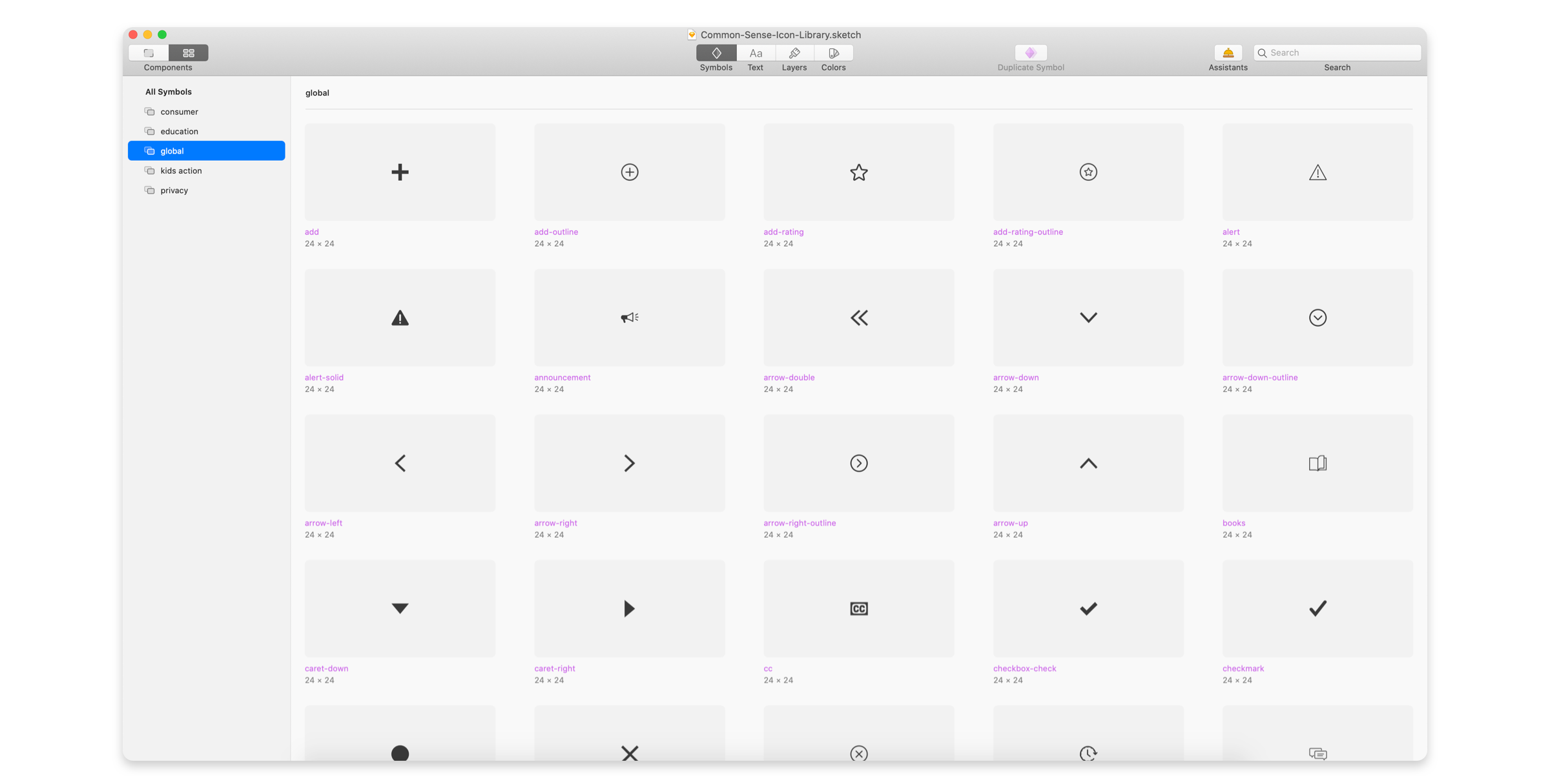
‘Common Kit’ – interface style guide and front-end repository for Common Sense product experiences
Shared pattern libraries with reusable UI elements for faster design comps and spec handoffs
More collaborative and efficient workflow between design and engineering
Easier cross-browser/device, performance, and accessibility testing
How Do You Tackle Years of Design Debt?
When I joined Common Sense Media in 2016, I was faced with the huge challenge of designing solutions for a website that had years of legacy code with multiple CSS redundancies (Using CSS Stats, I was able to determine that the Consumer site, alone, had a total of 300 unique font sizes and around 265 unique background colors.). The interface was scattered with visual inconsistencies which often resulted in awkward user experiences.
I also learned that the engineering teams for the two main product experiences: Education and Consumer, worked in silos, with barely any shared resources for front-end styles or code. In addition, there was very little interaction between design and engineering, and most of the communication happened through project managers on a weekly basis. This made the design and build process tedious, and design approvals quickly became a frustrating experience.

Building Relationships
I knew that there was a need for an improved design process which would not only elevate the product experience but also increase the team’s overall work efficiency. I began to look for design advocates within the engineering team to gain consensus. I reached out to individual developers and project managers in order to learn more about their process and understand their pain points. I learned that while there was a lack of shared interface standards, there was no dearth of efforts in the right direction albeit at an individual scale (illustrated by the two images below).

Screenshots of two existing engineer-led initiatives: A documentation of used font icons across the Consumer site (left) and a CSS style document for the Education site (right)
It was clear that the team could benefit greatly from the creation of a UI style guide. A style guide could help in many ways, including:
Enabling a consistent user experience with a focus on accessibility
Increasing efficiency by cutting design and engineering time
Enabling the team to focus on product innovation instead of fussing over pixel perfection
Facilitating in-browser design, review, and UX testing of our responsive patterns
Creating a central, shared repository for front-end patterns and code
The advantages were undeniable and once the design and engineering teams were on board, it was easy to win support from the product stakeholders.
Site Audit
Next, I led an interface audit with the design team so that we could begin to identify existing patterns and potential components across the current sites. This exercise was a necessary step to round up and categorize all the unique patterns that made up the user interface. At this point, we began to dive deeper into questions like:
Which elements of the site should be prioritized for adding to the component library?
What was the purpose of a UI element and could it be clubbed with other elements that served the same need?
Are there any elements we can leave out?
What should we name a particular component?

Adopting a Modular Approach
After preliminary discussions between designers and front-end developers, we decided to use a modular approach to build our pattern library. This would involve breaking the existing interface down into basic components and then working up from there to create an effective design system.Taking inspiration from the Atomic Design methodology, the team settled on the following ‘building block’ categories for the style kit:
Utilities: Core styles that are applied and shared across components. Ex: colors, typography
Atoms: Foundational building blocks of the design system which cannot be broken down further without losing their meaning. Ex: headings, buttons
Molecules: Group of atoms pieced together to take on new properties and form more complex and bigger functional patterns. Ex: dropdowns, pagination
Layouts: Options for laying out content or components on a page. Ex: grid system

Responsive Grid System
For ‘layouts’, the first step was to develop a functional and responsive grid system for the website. The existing interfaces did not follow a grid layout and the responsive approach for the two sites differed from one another (desktop-first vs. mobile-first).
These decisions had been based on user traffic stats in the past and seemed focused on common devices instead of striving for a truly responsive UI. What we needed was a more forward-looking approach, one that continued to adapt with the advent of new technology and devices in the future.
With this in mind, and keeping in line with industry standards, we established a responsive UI based on a 12-column grid layout. This would help create visual consistency and balance, while allowing flexibility across a wide variety of page designs.

Establishing Design Principles
In order for the team to have a collective vision for the product experience and an understanding of what made it special, we needed a framework for collaborating and shaping our decisions as we created, iterated, and refined our products. Having org-wide design principles would lend us much needed inspiration, enabling us to take a stand and truly care about the products we were building.
Using existing research on users' needs, brand positioning, and the organization’s mission as a starting point, we brainstormed a few ideas. These ideas were refined in collaboration with the content strategist.
We finalized three design principles based on trust, guidance, and access:
We design to build trust
Our independent, unbiased products, reviews, and advice are grounded in research and cognitive development standards. We protect user privacy. We champion user needsWe guide people to make informed choices for their kids
Our design systems should highlight subject matter in a way that enables users to explore and discover what's right for themWe welcome everyone
We believe interface design, copy, and functionality should facilitate user-performance for everyone regardless of abilities, education, and socio-economic background
Bringing It All Together
Although there is work still to be done, the design and engineering teams at Common Sense have come a long way since the beginning of the style guide work:
Most interface components are documented and hosted on GitHub pages that are accessible to the entire org
Shared Sketch libraries across the design team make comp creation and prototyping a breeze
Bonus win: Easier on-boarding process for new hires


Common Kit: A Living Document
As I reflect over the past 5 years, it is a sobering reminder that a small team (2 designers, 5 front-end engineers, 1 project manager) with limited time and resources have managed to turn the web style kit from a dream into a reality which will continue to serve as a solid foundation for changing needs in the future.
Today, the Common Kit work continues, often competing with other task priorities. In this context, having a sustainable process is important in order to keep the momentum going. We have learned many lessons along the way and this has led to the creation of our current workflow, which includes:
Communication: A dedicated Slack channel for all Common Kit related discussions and questions
Check ins: Bi-weekly meetings between front-end and design to discuss status updates
Project management: A self-sustaining dashboard in Asana with timelines and tasks prioritized using a total score of design effort, engineering effort and user priority
In addition, we have consistently presented the value of our work org-wide and to leadership. This has helped us garner support for at least two style guide freeze periods which were dedicated to Common Kit work without the distraction of other projects.

A snapshot of the Asana dashboard showing the current workflow:
(1) Research: Is it component-worthy? (2) Design (3) Engineering (4) Code review (5) Design review (6) Documentation review